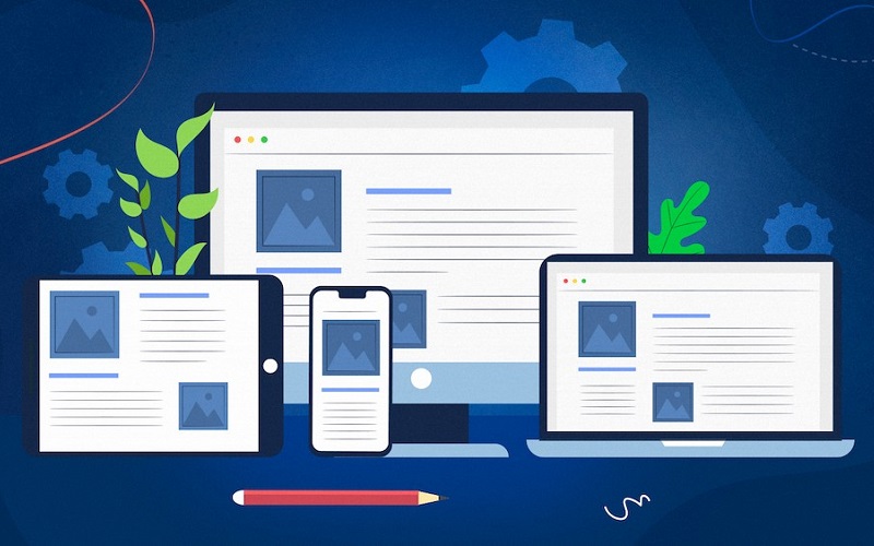
In today’s digital age, designing a responsive website—one that works seamlessly across all devices—has become essential for developers and web designers. However, a common question arises when starting to build a responsive website: Should you choose Mobile First or Desktop First? Both approaches have their pros and cons, and the right choice depends on your project goals and target audience.
1. What is Mobile First?
Mobile First is a web development approach that prioritizes the design and user experience on mobile devices. When designing this way, you start by creating the website with a focus on small screens and then scale up to larger screens like tablets, laptops, and desktops.
Advantages of Mobile First:
- Optimized for mobile users: With the rapid growth of smartphones, the number of people accessing the web via mobile is increasing. Designing Mobile First ensures a smooth and optimized experience on smaller devices.
- Better performance: Mobile First often requires simplifying the interface and content, which helps the website load faster on devices with lower specs and slower networks.
- Easier to scale up: Starting with mobile devices creates a lightweight foundation that can be easily expanded to include more features and a more detailed interface on larger screens.
Disadvantages of Mobile First:
- Limited space: The small screen of mobile devices forces you to limit the amount of information and features displayed, which might not fully meet the needs of desktop users.
- Complex to scale up: When expanding the interface from mobile to desktop, you’ll need to add more elements, from larger images to more complex features, which can make development time-consuming and challenging.
2. What is Desktop First?
Desktop First is the opposite approach, where you design the website based on large screen sizes, typically desktops or laptops, and then adjust and scale down for smaller devices like smartphones and tablets.
Advantages of Desktop First:
- Full feature display: With the larger space on desktop screens, you can easily implement complex features and detailed layouts without the restrictions of limited screen space.
- Suitable for data-heavy projects: Websites that provide a lot of content or complex web applications often require focusing on desktop first to ensure all features are displayed clearly and intuitively.
Disadvantages of Desktop First:
- Difficult to scale down: When transitioning from large screens to small ones, maintaining a good user experience and visual layout can be challenging. You may struggle to trim down or simplify elements without compromising user experience.
- Performance issues on mobile: If not optimized properly, Desktop First websites can be heavy and slow on mobile devices, negatively affecting the user experience.
3. Should You Choose Mobile First or Desktop First?

The choice between Mobile First and Desktop First depends on the needs of your project and your target audience. Here are a few factors to help you decide:
When to choose Mobile First?
- When your primary audience is mobile: If the majority of your customers access your website via mobile devices, designing Mobile First will ensure an optimal and user-friendly experience.
- Simple and easy-to-use websites: E-commerce sites or services that provide simple information often benefit from a Mobile First design due to its usability and fast loading speed.
- SEO optimization: Google and other search engines now prioritize mobile-friendly experiences. Designing Mobile First can improve your website’s SEO ranking.
When to choose Desktop First?
- When your website is complex and requires more space: If you’re developing a website with complex features and large amounts of data, such as web applications or enterprise management platforms, Desktop First will ensure that all features are displayed clearly.
- When your users are mostly on desktops: For projects targeting users who primarily use desktops, starting with desktop designs ensures the best possible experience for this audience.
4. Combining Both Strategies: Flexible Responsive Design

In many cases, you don’t have to strictly choose between Mobile First or Desktop First. A combined strategy, starting with one approach but adjusting flexibly as needed, can be highly effective. For example, you might start with Mobile First to ensure performance on mobile devices, then expand to desktop by adding extra features.
Conclusion
Choosing between Mobile First or Desktop First when designing responsive websites depends on factors such as your audience, project goals, and the complexity of the site. For websites that prioritize speed and mobile optimization, Mobile First is the ideal choice. On the other hand, websites that require complex features and ample screen space will benefit from Desktop First. However, the best strategy is to create a flexible design that meets the needs of users across all devices, ensuring a smooth experience on any platform.