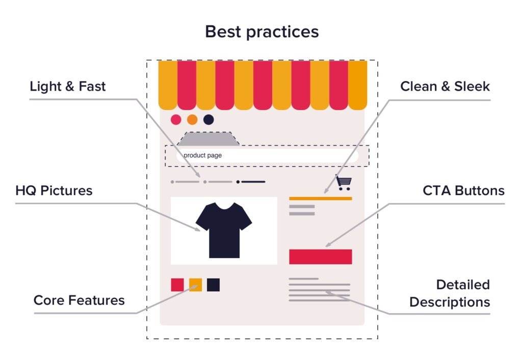
In the fast-paced world of e-commerce, your product page is like the red carpet at a premiere—it’s where the magic happens. Whether a customer arrives from a Google search or has browsed through multiple categories, this page plays a pivotal role in their purchasing decision. A well-crafted product page can do wonders:
- Reassures Visitors: Confirms they’re in the right place.
- Generates Excitement: Kindles enthusiasm about the product.
- Soothes Anxieties: Eases uncertainties related to buying.
- Encourages Immediate Action: Nudges the shopper to buy promptly.
- Facilitates Upselling: Naturally introduces related products or services.

What Makes a Stellar Product Page Design?
These goals might seem ambitious for a single page, but with mindful design choices, they are within reach. Let’s explore outstanding product pages from top e-commerce websites and identify the key elements that make them effective.

Zalando: A Lesson in UX Excellence
Zalando, a trailblazer in fashion e-commerce, sets the standard for exceptional product page design with relentless innovation and testing. Here’s a look at Zalando’s approach:
- Standout Visuals: Engaging, high-quality images bring products to life, bridging the gap between the virtual and the tangible.
- Accessible Image Carousel: A straightforward and engaging way to explore multiple images boosts product desirability and attachment.
- Credibility Signals: Phrases like “most popular and least returned” bolster trust in a product’s reliability.
- Common Questions Resolved: Clear delivery information keeps customers from veering off in search of details.
- Addressing Anxieties: A reassuring 100-day return policy addresses concerns about fit and suitability.
- Streamlined Details Exploration: Essential information is provided upfront, while deeper insights are available for those interested.
- Complementary Upsells: Features like “complete the look” seamlessly integrate practical product usage suggestions.

Amazon: Optimizing for Conversions
Amazon masters the art of presenting a wide array of products effectively on its product pages. Here’s how they do it:
- Prominent Visuals: No matter if it’s tech gadgets or home essentials, high-quality visuals are a must.
- Clickable Image Previews: Encourage users to explore an extensive array of product visuals.
- Ratings for Reliability: User ratings offer trust signals, showcasing reliability.
- Efficient Search Feature: Enables page-specific searches for swift access to crucial information.
- Proof of Popularity: Displays recent purchases to enhance perceived product worth.
- Easy Variant Switching: Allows users to change colors or styles effortlessly, staying on the same page.
- Delivery Date Countdown: Urgency indicators encourage prompt purchasing decisions.
- 1-Click Purchase Option: Simplifies buying, reducing barriers to checkout.
- Comparison Tables: Facilitate comparisons without navigating away.
- On-page Alternative Purchases: Offers seamless additions of similar items to the cart.

Walmart: Accessible and Functional
Walmart excels at creating a user-friendly experience for shoppers seeking convenience:
- Effective Visual Presentation: Captures interest at the first glance.
- Powerful Ratings Display: A large volume of user feedback serves as a trust marker.
- Concise Overview: The “At a glance” feature delivers essential information instantly.
- Credibility with Badges: Trusted badges boost consumer confidence.
- Non-intrusive Upsells: Offers optional services or warranties without being pushy.
- Clear Shipping Options: Transparency in delivery details allows for quick decision-making.
- Interactive Explore Mode: Makes finding additional information engaging and interactive.
- 3D Product Previews: Offers a virtual checkout experience.
- Feature Explanations: Breaks down technical jargon to aid comprehension.
- Persistent Call to Action: Ensures purchasing options remain within easy reach.

New Balance: Blending Brand and Usability
New Balance brings a unique spin on product pages focused on brand and usability:
- Comprehensive Image Gallery: Allows swift evaluation from several angles.
- Simplified Size Selection: Makes selecting the right size a straightforward decision.
- Helpful Tooltips: Size guides prevent sizing confusion.
- Subtle Upselling: Offers additional suggestions seamlessly without being overbearing.
- Verified Customer Reviews: Builds trust through authenticated opinions.
- Detailed Ratings Categorization: Categorizes reviews for deeper insights.
- Sticky Purchase Options: Keeps add-to-cart functionality always accessible.

Key Takeaways
From these examples, several universal principles emerge:
- Harness High-Quality Images: Visual appeal is critical in drawing users in.
- Streamline Information Retrieval: Make pivotal details easily accessible.
- Practice Smart Upselling: Keep additional offers relevant and non-intrusive.
- Build Credibility: Utilize reviews, badges, and popularity indicators to create trust.
- Maintain Page Engagement: Facilitate seamless browsing of variants and details.
- Simplify the Sales Path: Keep calls to action visible for an effortless purchasing experience.
Although layouts and styles may differ, sticking to these core principles will ensure your product page is both engaging and effective, catering to the varied needs of your audience.


